

Repsol, one of the industry's historic giants, unveiled this month a new corporate identity that goes far beyond a simple aesthetic redesign. This change is not just an aesthetic exercise; It is the visual manifestation of one of the most profound and complex business transformations of recent years. In a context where the energy transition is forcing large companies to redefine their purpose and value proposition, with competitors such as CEPSA evolving towards Moeve, Repsol's rebranding stands as a real master class on how to align a brand's identity with a radical evolution of its business.
Repsol's decision to renew its identity was not a choice, but an imperative necessity dictated by a profound internal transformation. The brand that the world knew, strongly anchored in the era of hydrocarbons, was no longer able to represent the reality of a company in full metamorphosis.
At the core of this transformation is the move from a traditional oil company, vertically integrated into the oil and gas sector, to a diversified provider of energy solutions. This strategic evolution is materialized in significant investments in renewable energy generation, a growing electric mobility network, and the development of synthetic fuels and advanced biofuels, such as renewable diesel (HVO).
The previous visual identity, with its strong association with fossil fuels, had become a strategic liability. Not only did it fail to reflect the diversification of the company's portfolio, but it hindered its ambition to lead the transition and circular economy. The brand needed to evolve to faithfully represent what the company is and ago currently, connecting with people's daily needs and showing their ability to offer the energy that society demands.
The company's new motto, "With All the Power", is a key piece that encapsulates the intelligence of its new positioning. This slogan does not represent a radical and exclusive turn towards "green", but a pragmatic and inclusive stance that masterfully navigates the complexities of today's energy landscape.
The genius of the slogan "With all the Energy" lies in its ability to resolve this tension. It does not prioritize one energy source over another. Instead, it positions Repsol as an agnostic and complete solutions provider, capable of offering "all the energies its customers need in mobility and at home." This allows the company to continue operating and generating value from its traditional hydrocarbons business, while credibly building its market share in the new energy sectors. The brand thus becomes a flexible and future-proof container, able to adapt to unpredictable market changes and regulation. It is a movement that, as experts point out, was approached "with ambition, but also with realism".
This rebranding aligns perfectly with one of the key branding trends for 2025: the need for a "down-to-earth purpose." Repsol's stated purpose is tangible and realistic: "to provide energy solutions that promote well-being." It moves away from grandiloquent statements to focus on a concrete and credible objective. New branding is therefore the external manifestation of this internal transformation, a conscious effort to align the brand's promises with its actual actions, thus building a solid foundation of trust with a society that demands authenticity and facts.

Repsol's new visual system is an exercise in balance, where each element has been carefully redesigned to communicate the brand's new values without sacrificing the enormous visual capital accumulated over decades.
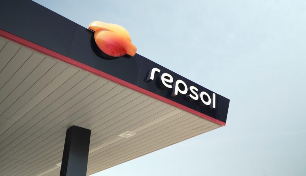
The most critical decision was to evolve the iconic symbol of the sun on the horizon rather than discard it. The brand has a very high level of recognition and value, built since its original creation by Wolff Olins in 1986 and its subsequent updates. A total break would have been a strategic mistake.
One of the most noticeable and effective changes is the adoption of a new proprietary typeface, "Sole Repsol", designed by the prestigious Dalton Maag foundry. The move to a logo written entirely in lowercase is a tonal statement of intent. This resource seeks to humanize the brand, projecting a closer, more accessible and contemporary tone, in contrast to the authority and rigidity that capital letters often convey.
The most eloquent change in the new identity is the colour palette, where the brand's characteristic colours are revitalised through a gradient that goes from orange to magenta. This gradient is not a simple aesthetic trend; it is the central visual metaphor that narrates the company's entire transition strategy.
Color is the most immediate identifier of a brand. Repsol's historic red/orange is inextricably linked to its legacy in hydrocarbons. An abrupt change to a color like green, for example, would have been forced and unbelievable. The gradient, on the other hand, represents a journey, an evolution. It starts in the familiar orange, acknowledging the brand's heritage and the continuity of its current business, and flows naturally into a vibrant, modern magenta.
This magenta is not an arbitrary color. It has been strategically chosen to be linked to the company's new sustainable products. In fact, magenta is the new colour code that identifies 100% renewable diesel (HVO) at service stations. The logo itself therefore tells a story: "We are on a journey that starts from our origin (orange) towards our sustainable future (magenta), and it is a continuous and fluid process." This element visually encapsulates the "multi-energy" and "transitional" narrative in a single graphic gesture.

A rebranding strategy of this magnitude requires flawless execution. Repsol has demonstrated meticulous planning both in its external communication and in its crucial internal activation.
To present its new positioning and identity, Repsol launched the "Interruptores" campaign, developed by the creative agency Fuego Camina Conmigo. The creative concept is powerful and aspirational: it positions Repsol not only as an energy supplier, but as a catalyst, a "switch" that allows people to break with routine, darkness or doubt to achieve their goals and move forward. It's a human-centered narrative that elevates the brand above its functional category.
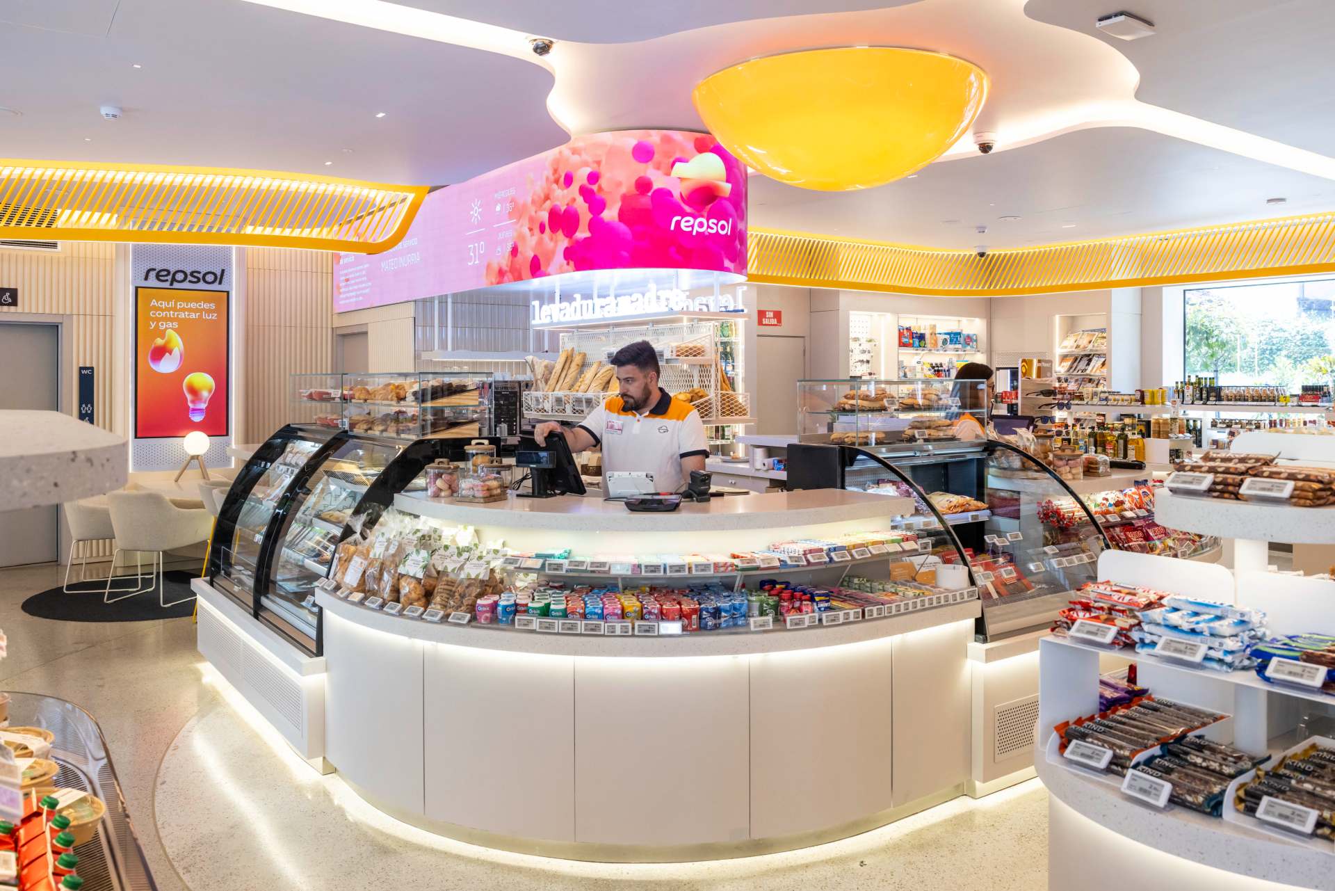
In short, Repsol's rebranding is much more than a design exercise; It is a palpable demonstration of the power of the physical point of sale and signage as pillars to materialize a new brand vision. For a company like Repsol, with thousands of physical touchpoints, the promise of "all energy" and sustainability only becomes real when the customer sees and feels it in the tangible world.
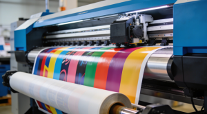
This is where our sector, that of visual communication and signage, plays a leading and irreplaceable role. The transformation of each service station – from the imposing and renovated monolith that captures attention on the road, to the new signage at the pumps with its innovative colour coding – is proof that the brand strategy comes to life through materials, lights and shapes. Projects like this show that signage is not just an ornament, but a fundamental strategic tool


