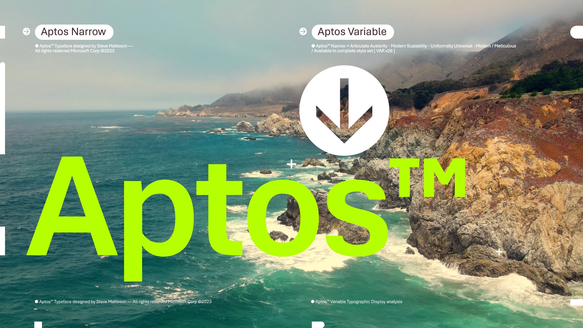


Over the past 15 years, Calibri has been more than a source for Microsoft; It has been an emblem of everyday digital communication. However, in a world where technology and visual needs are advancing by leaps and bounds, the need to evolve is imperative. Microsoft is embarking on a quest to find a font that not only meets today's demands for clarity and adaptability to new technologies, but also ushers in a new era in digital typography. This trip isn't just a change in style; It's a step into the future, where readability and aesthetics come together to enhance our digital experience.
The decision to replace Calibri was not taken lightly. Calibri has been a constant in our digital lives, offering clarity and visual comfort in every document, presentation, and email. However, technological evolution calls for a font that is better suited to today's high-resolution screens and diverse digital contexts. The mission was clear: to find a typeface that reflects the dynamism and innovation of today's technology, while maintaining the functionality and aesthetics that Microsoft users have come to expect and appreciate.
The process of selecting the new source was exhaustive and participatory. Microsoft presented five candidates: Bierstadt, Grandview, Seaford, Skeena and Tenorite, each with unique characteristics, designed to be the possible successor to Calibri. Including these fonts in the Microsoft 365 selector was the first step toward choosing, allowing users to experiment and offer their opinions on each one. This strategy not only demonstrated Microsoft's commitment to its users, but also underscored the importance of feedback in the innovation process.

Aptos' design is a confluence of natural inspiration and a search for humanity. Matteson wanted Aptos to resonate with universality and human appeal, taking cues from media figures renowned for their ability to connect with audiences. This humanistic approach is reflected in subtle details, such as the slight balance of the doubly stacked "R" and "g", adding a personal and accessible touch to the font. The intention was to create a typeface that was not only functional but also expressive, capable of inspiring confidence and comfort in reading.
Aptos stands out for its sans serif design, a choice that reflects the mid-20th-century Swiss typeface trend toward simplicity and legibility. Clarity and precision are key to Aptos' design, with uniform strokes and geometric shapes that make it easy to read in different sizes and contexts. In addition, the inclusion of varied font weights allows for greater flexibility in communication, offering users the ability to establish visual hierarchies and direct attention effectively.
Aptos' design philosophy emphasizes the importance of warmth and humanity in communication. Comparing the experience of reading Aptos to hearing a human voice rather than a GPS voice, Matteson underscores people's natural preference for warmth and human connection. This approach extends to the creative process itself, where hand drawing plays a crucial role. For Matteson, starting with pen and paper is essential to capturing the essence and nuances of typographic design, ensuring that each letter conveys the desired intent and emotion.

After receiving feedback from users, the choice was clear: Bierstadt, now renamed Aptos, stood out from the crowd. This change not only represents a typographic renovation, but also a tribute to the inspiration behind its design. Aptos is not just a source; It is a reflection of the human experience, designed to deliver sharpness, consistency, and optimal performance in a variety of visual contexts. The transition to Aptos marks an exciting and challenging time in Microsoft's history, where adaptation and continuous improvement are key to meeting user needs.
Steve Matteson, the talented designer behind Aptos, has been instrumental in this renovation process. With an impressive track record that includes developing the original TrueType fonts for Windows and creating Segoe, Matteson brings a deep understanding of typography and design. The decision to rename Bierstadt to Aptos is a tribute to his favorite city in California, reflecting the natural beauty and diversity of the landscape that so inspired Matteson. This name change symbolizes the connection between nature, humanity and technology, fundamental elements in Aptos' design.
Introducing Aptos in Word, Outlook, PowerPoint, and Excel is just the beginning. In the coming months, Microsoft will roll out this font as the default option for hundreds of millions of users, a significant change it's eagerly awaiting. The choice of Aptos as the new default font is a testament to Microsoft's desire to deliver an improved user experience tailored to today's visual and technological demands. This shift not only reflects a breakthrough in digital aesthetics, but also marks an ongoing commitment to innovation and improving the user experience.
Aptos' creative process began in the most traditional way: with pen and paper. Steve Matteson, its creator, emphasizes the importance of this approach to capturing the essence and nuances of type design, a practice he sees as critical to preserving the craftsmanship behind font creation.
Aptos symbolizes more than a change of source; It represents an evolution in the way we interact and communicate in the digital space. Microsoft has taken a bold step into the future, redefining the aesthetics of our digital tools to improve the user experience. With Aptos, Microsoft is not only looking to offer a typeface that is visually appealing and functional, but also to foster a connection