

We've all made mistakes when making a design: using a blurry image, combining too many fonts, or asking for the logo to be larger than necessary. These failures, as common as they are frustrating, are usually the day-to-day life of many designers. But instead of hiding them, Canva has decided to make them the protagonists of its latest advertising campaign.
With a series of posters installed in the Waterloo , in London, the design platform has transformed those "disasters" into creative, fun and highly visual messages. The result not only catches the eye, but also shows how Canva can help you avoid them. A campaign that combines humour, functionality and great visual impact.
In the daily practice of graphic design, there are certain mistakes that are frequently repeated: unprofessional typographies, low-resolution images, overloaded compositions or size mismatches. Canva, together with the creative agency Stink Studios He has had the brilliant idea of collecting these errors and, instead of hiding them, giving them visibility as part of a creative narrative. In his campaign, phrases such as "When you "make the logo bigger" it gets a little out of hand" or "Drag and drop (almost) anything" are not shown as failures, but as humorous winks with which many feel identified.
This approach not only captures attention, but also generates complicity. Both professional designers and casual Canva users find these posters to be a relatable experience. The campaign shows that making mistakes is part of the creative process and that you don't have to be afraid of mistakes: the important thing is to have tools that help you overcome them.
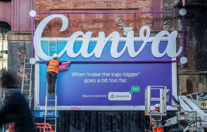
One of the most prominent elements of Canva's advertising campaign in London was the use of creative advertising installations that took design errors to the extreme, both in form and concept. Among the most commented posters is the typical question "Can you make the logo bigger?" next to a three-dimensional logo that protrudes from the poster on an exaggerated scale. This poster became one of the most photographed and shared on social networks, literally representing a typical request that usually frustrates designers.
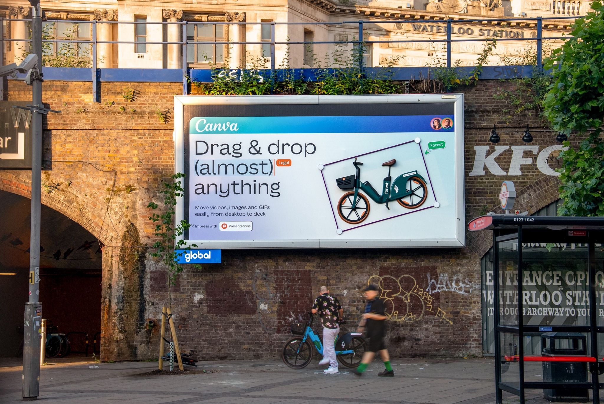
Another brilliant example is the poster that simulates the "drag and drop" function. In it, a real bicycle appears to be being shifted into the design by a giant graphic hand. This piece visually represents how intuitive Canva is to use, and how any element can be easily integrated into a project.
London's Waterloo station, one of the UK's busiest points, became the epicentre of a visually striking campaign. Canva transformed this everyday space into an interactive storefront. Through original and surprising posters, each visual piece was linked to a real function of the platform. Here are some of the highlights:
Another poster features a forced image in the wrong space, as if it had been designed horizontally but pasted vertically. The result is visually distorted content that represents a common mistake when adapting graphic pieces to different formats. Canva uses it to introduce its Magic Resize tool, which allows you to automatically resize designs to fit different media without losing quality.
Another surprising piece has parts of its surface cut out, revealing the wall behind. This simulates the effect of Canva's background removal tool, which allows you to isolate elements and visually clean up a composition.
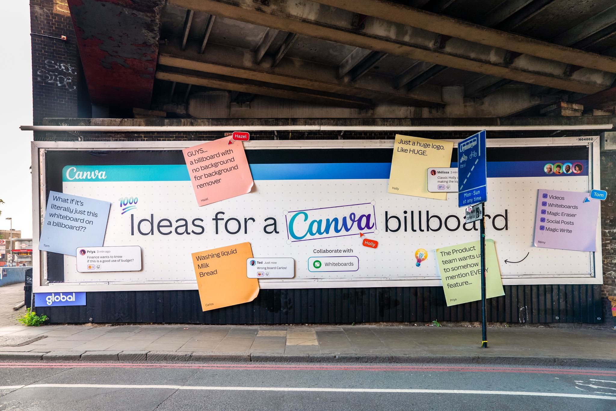
One panel simulates a whiteboard full of sticky notes with messages like "Finance wants to know if this is a good use of budgeting," "Just a huge logo. HUGE", "The product team wants us to mention ALL the features in some way..." This intentional chaos represents the multiple comments a designer receives during a review. Canva takes the opportunity to remember that its platform facilitates collaborative work online, allowing you to manage versions and suggestions in an organized way.
Canva's Waterloo Station ad campaign is a shining example of how a brand can turn common mistakes into a tool for connecting with its audience. Through humor, visual exaggeration, and direct messages, Canva has been able to laugh at the typical flaws of graphic design and, at the same time, show how its platform can solve them in a simple way.
It has not only been a creative campaign, but also a very strategic one. Each poster, in addition to being impressive for its originality, communicated a specific function of the product. In addition, by designing the ads to be shared on social networks, they were able to amplify their reach organically and globally.
In short, Canva has proven that even mistakes can turn into brilliant ideas if used wisely, and that a well-thought-out campaign can educate, entertain, and promote at the same time.


