In the heart of the UK's fifth busiest airport, London Luton Airport (LLA), a rebranding project was conceived that promised to transform the traveller experience. London-based design agency, ICO Design, was faced with the challenge of developing a visual identity that would not only reflect the modernity and efficiency of the airport but also improve navigation and signage within the airport. Their solution: the creation of a bespoke typeface, designed not only to be aesthetically pleasing but to intuitively guide millions of passengers through their facilities.
The Birth of the Luton Fountain
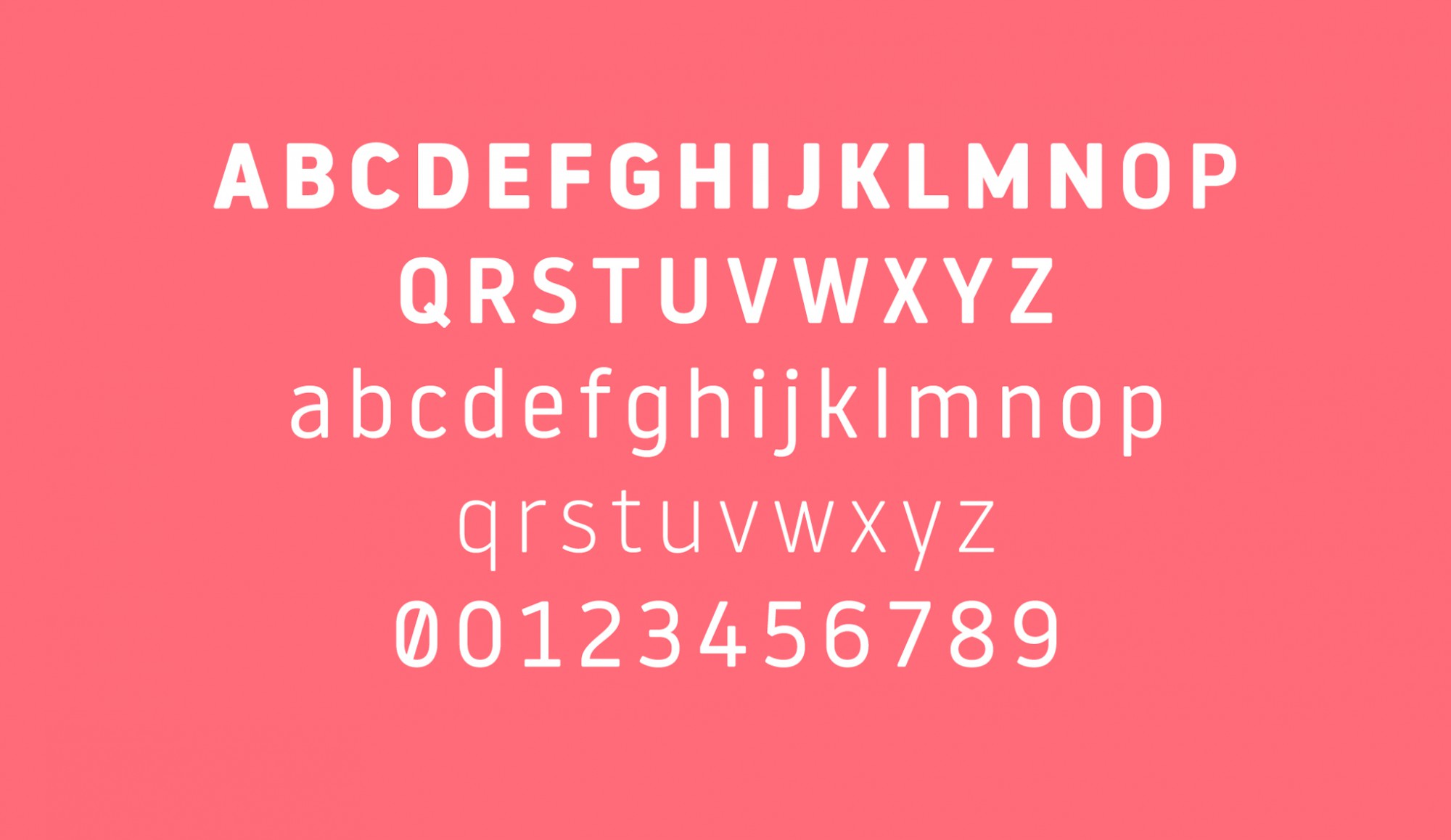
The Luton typeface, developed specifically for London Luton Airport, is the result of a meticulous design process that sought to balance functionality and personality. Taking inspiration from classic fonts such as DIN, Helvetica or Frutiger, and maintaining the spirit of contemporary fonts such as Neo or Simple, the font was conceived to capture the best of both worlds. With four weights – light, regular, bold and black – the font was perfectly suited to both the airport's graphic identity and signage program.
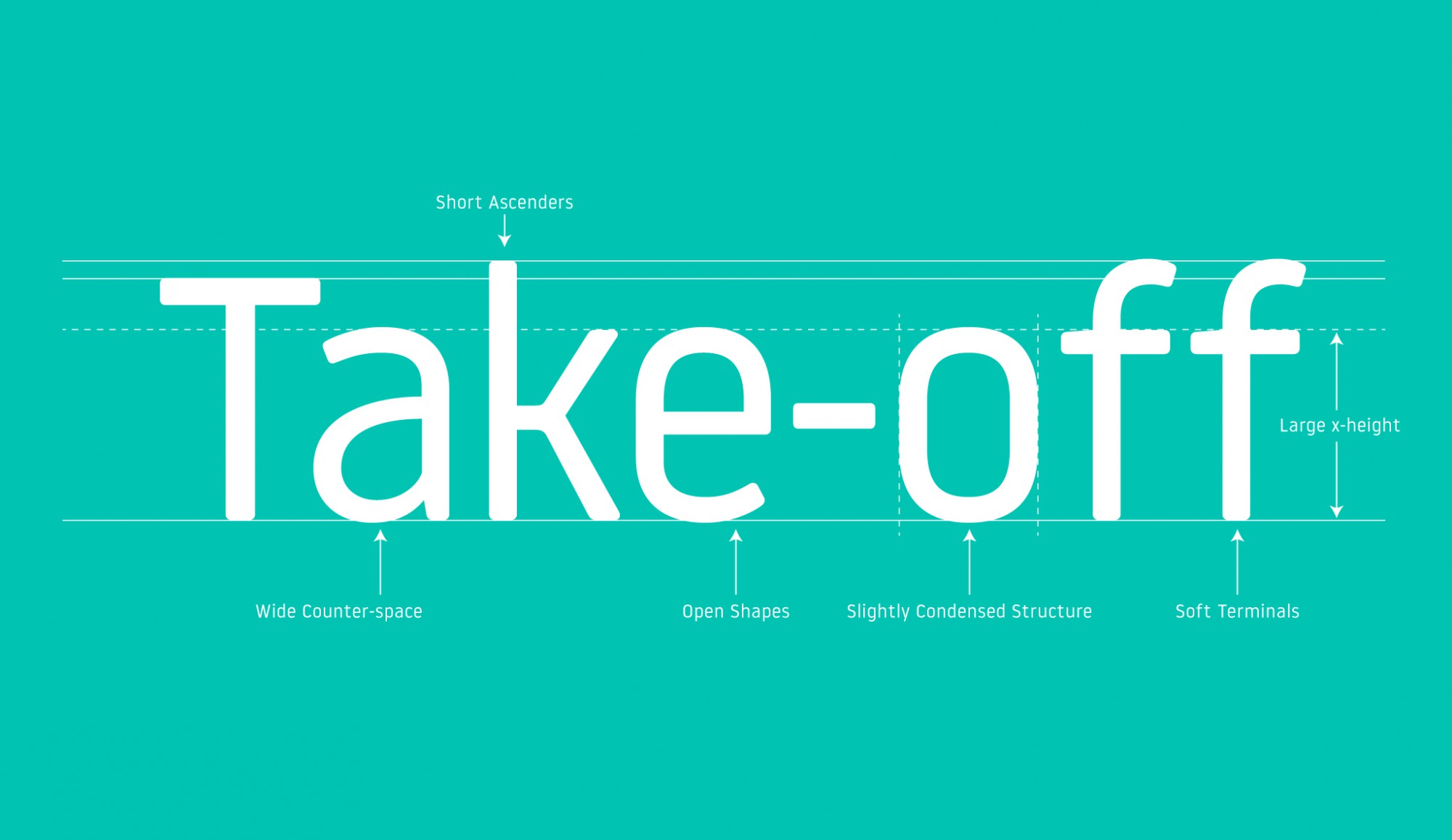
The anatomy of the Luton fountain
The Luton font stands out for its slightly condensed structure, which allows you to save space without sacrificing legibility. Its large x-height and the open shapes of its lowercase letters (a, e, g, s) improve the distinction between similar letters such as 'o', making it easier to read quickly and from afar. This combination of technical features with a humanistic touch and rounded finishes, gives the font a friendly yet distinctive personality, ideal for an environment as dynamic as that of an international airport.
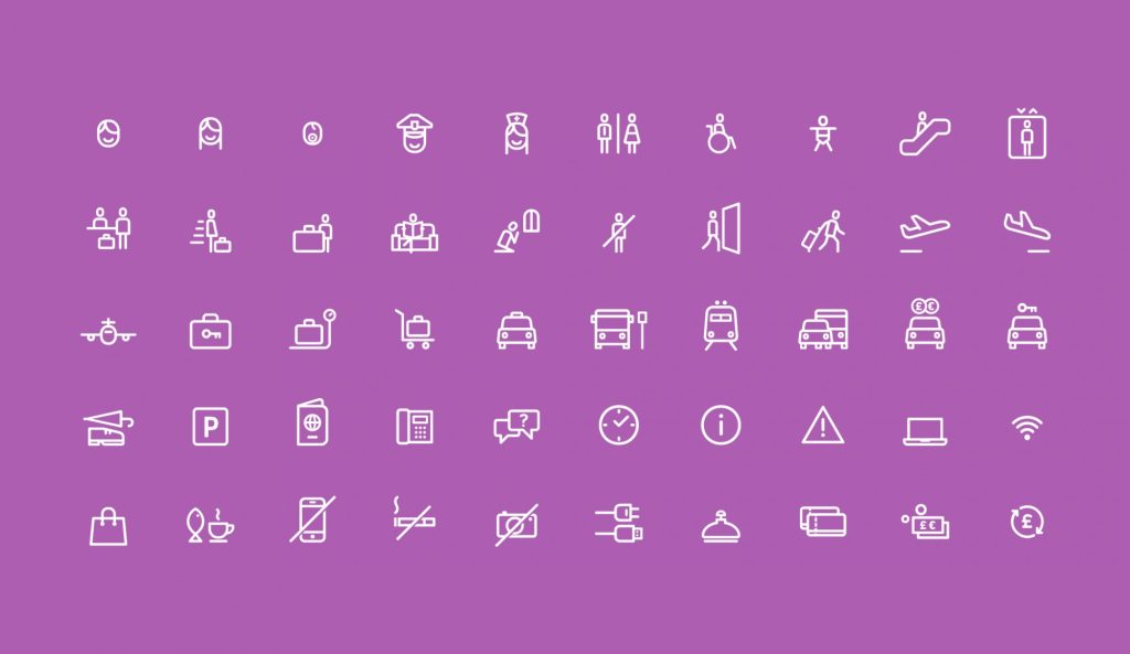
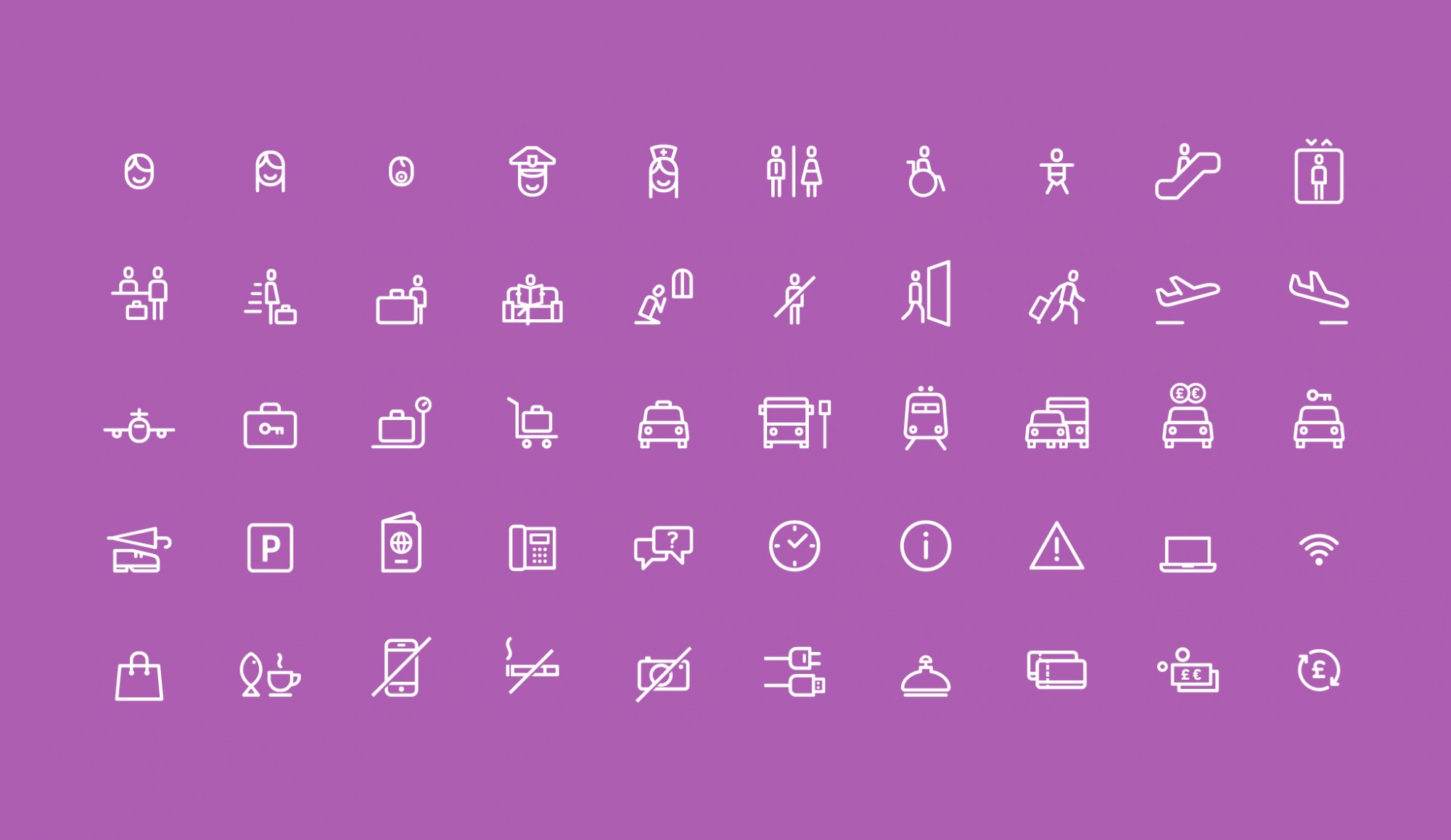
Iconography: Extending Visual Identity
In addition to the typography, a set of icons was developed to complement the signage program, designed with an aesthetic consistent with the Luton font. Aiming to be intuitive and friendly, these icons encompass essentials within the airport, from toilet signage to passport control and first aid. The shape of the letter 'o' in the typography served as inspiration for the structure of these icons, ensuring a harmonious visual integration between text and image.
Luton, more than a fountain
Typography represents more than just a font; is a navigation tool designed to enhance the experience for travellers at London Luton Airport. Through considerate design and exceptional functionality, LLA manages to effectively direct passengers, reducing stress and improving fluidity within the airport. This project highlights the importance of effective signage and how typographic design can play a crucial role in the orientation and overall user experience in complex public spaces.
I help SMEs with their visual marketing and online marketing strategies through the firms Xprinta group and Digital Dystopia. Develop the full power of your brand wherever it is shown to the public.