2004: Birth of an Icon. In the heart of vibrant Amsterdam, a symbol is born that would capture the essence of the city: the corporeal letters of the " I Amsterdam «. Red and white, they reflect the colors of the local flag and announce a new form of urban identity. Designed by the agency Kessels Kramer, these letters not only promote the city but become an integral part of its self-image.
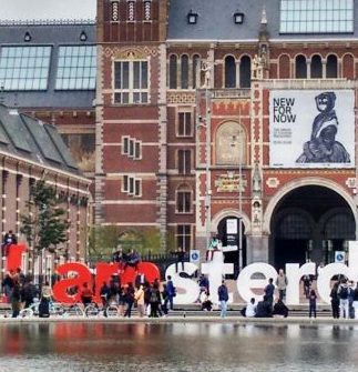
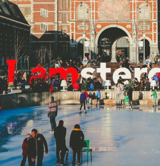
Years Following: The Rise of the Symbol. Made to impress and last, each letter is approximately 2 meters tall, and collectively, the letters span about 23.5 meters. Placed in front of the Rijksmuseum, they transform into a tourist magnet, with the "M" particularly inviting visitors to climb and capture unique moments. The " I Amsterdam » quickly established itself as the favorite meeting point and the perfect setting for photos.
2018: The End of an Era at the Rijksmuseum. The success of the " I Amsterdam " takes an unexpected turn when, in an effort to tackle overtourism and congestion, the Groen Links party leads the removal of letters from the front of the Rijksmuseum. This decision marks a significant change in the management of urban symbols and the relationship of the city with its tourism marketing.
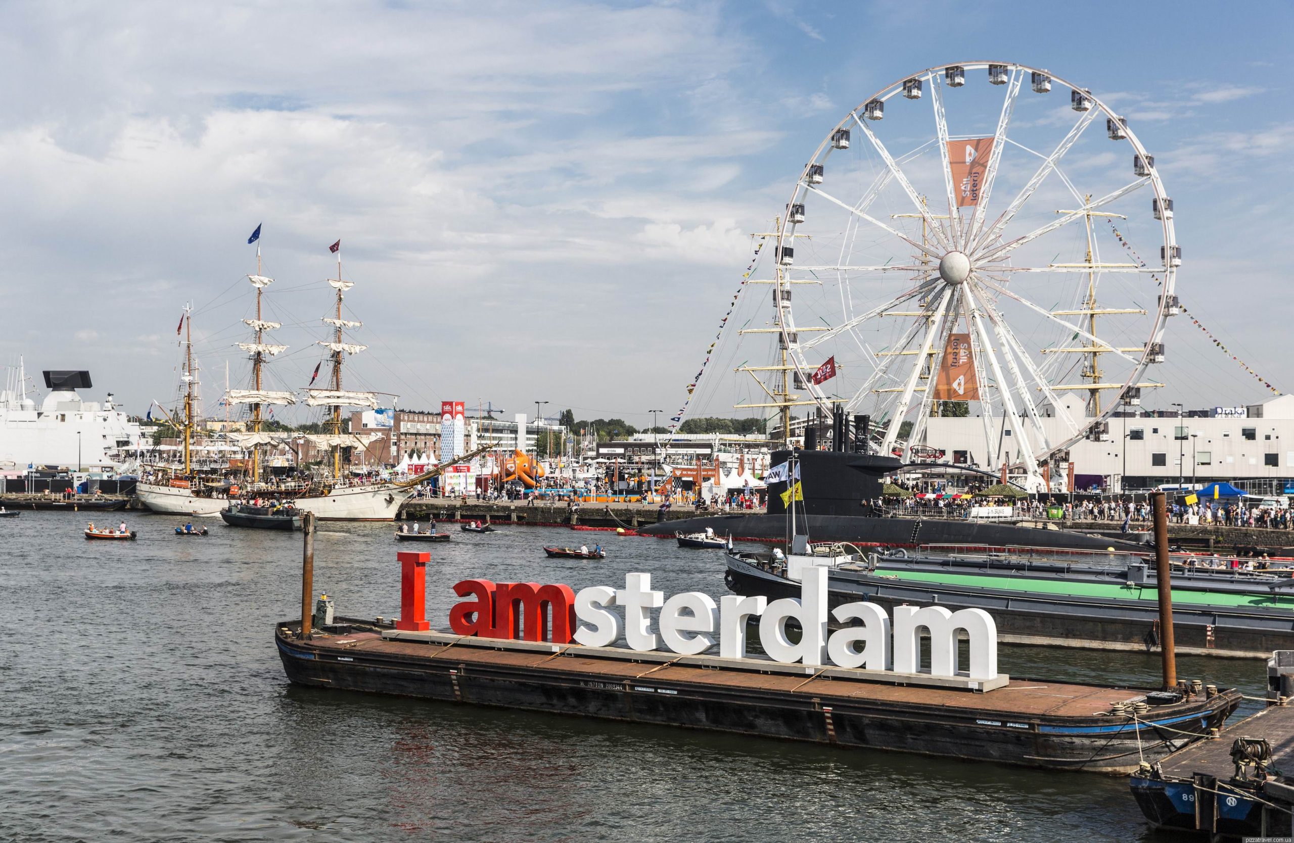
Actuality: The legacy continues. Despite its absence in its original location, the spirit of " I Amsterdam » is still alive. The letters are still erected at Schiphol Airport and Lake Sloterplas, and a traveling version continues to make appearances, maintaining the city's message of diversity and unique spirit. « I Amsterdam " has transcended its physical form to become an enduring emblem of the city.