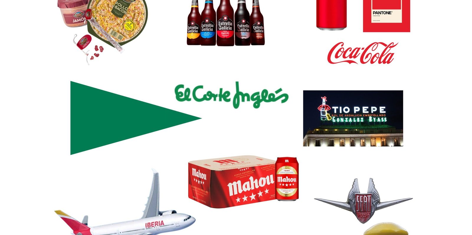
Brands like Correos to Terry, Osborne, or Camper, this is how recognizable brands without logos build an identity capable of surviving the name.
There are brands we recognize because we know how to read their name. And there are others that seem to reach our memory a few tenths of a second before we can. A yellow in the right place, a bottle with a certain shape, a texture, a silhouette on the side of a road, or even two shoes that are deliberately not the same are enough.
There begins the real game of recognizable brands without a logo. Because one thing is to have a famous emblem and another, much more difficult, is to build an identity capable of functioning when that emblem disappears. In Spain and in brands that, although not Spanish in origin, are part of our visual culture, we find numerous examples of how branding can end up installed not only in advertising, but also in the streets, bars, kitchens, roads, stations, or airports.
The question, therefore, is not who has the best-known logo. It is another: if we were to remove the name and logo of a brand, what would remain of it?
Would you be able to recognize a brand without seeing its logo?
It looks like a game, but it's a pretty serious question about brand identity. Let's first consider a simple test. We erase the name, but leave the colors, the shape of the packaging, the symbols, the characters, the architecture of the establishment, and any other visual code. Some brands would remain relatively easy to identify.
Now let's complicate the experiment.
In the strict test the main symbol also disappears. We can no longer rely on El Corte Inglés's triangle, Chupa Chups's flower, or any other particularly recognizable logotype. Only secondary signals remain: colors, materials, geometries, textures, packaging, objects, spaces, sounds, or rituals of use.
It is then that the question becomes much more interesting.
In branding, many of these signals are studied as distinctive brand assets: elements that help to recover a brand from our memory without necessarily depending on reading its name. To understand its strength, it is worth keeping two simple concepts in mind.
The first is fame, to what extent a sign is known and people associate it with a brand. The second is uniqueness, to what extent that signal leads specifically to that brand and not also to others in its category.
The difference matters a lot. A star can be tremendously familiar for a beer, but stars appear in more beers. A red can be recognizable, but it belongs to countless companies. That an element is famous does not mean it is exclusive.
That is why one of the best references to start the experiment is Coca-Cola. It is not a Spanish brand of origin, but it has been part of the commercial landscape and visual culture in Spain for generations. Its contour perfectly exemplifies the goal: to make the container's geometry act even when the name and label disappear.
Let's imagine the sequence. We remove the words. Chromatic codes and packaging remain. We also remove the characteristic writing. The bottle still remains. Even if we lost the color, a silhouette still survives.
That is much more than owning a famous logo. It is building redundancy: different elements capable of leading us to the same brand.
And here appears the first fundamental idea of this journey: a brand's identity reaches one of its highest levels when the name ceases to be essential.
A color, in isolation, almost never fully belongs to a brand. Yellow can mean hundreds of things. Red too. Green or purple, exactly the same.
But let's introduce the context and everything changes.
Let's think about Correos. Its yellow has not only been repeated in advertising campaigns. It has been transferred for years to mailboxes, vehicles, offices, and objects associated with a very specific activity. The result is that yellow ceases to function solely as a corporate color to become part of a small environmental system.
A yellow rectangle on a screen is ambiguous. A yellow mailbox on a Spanish street is much less so.
This mechanism allows us to understand why physical space can be so important for branding. Repetition does not only occur in advertisements: it happens while we walk, drive, or run errands. The brand is learned incidentally.
Yellow Pages took material identification even further. In this case, it wasn't simply a matter of printing an identity onto a medium; the medium itself contributed decisively to that identity. The directory's large physical volume, thickness, and yellow pages turned the object into a piece of visual and tactile memory. For certain generations, removing the name from the cover does not necessarily erase the memory.
With El Corte Inglés a very revealing difficulty arises. Its green color, its bags, and its massive presence in the commercial landscape provide recognition, but a large part of its graphic strength is concentrated precisely in the triangle. If we allow it to be kept, the test is simple. If we apply the strict version and also eliminate it, the identity has to rely much more on color, the media, the buildings, and the commercial context.
This does not mean the brand is less well-known. It means that brand awareness and the autonomy of its secondary assets are not exactly the same thing.
Something similar allows us to study the beer universe. Mahou has accumulated red, stars, packaging, and a very intense presence in hospitality. Together they form a recognizable system. Separated, however, some of those elements lose exclusivity. Red is shared; stars also belong to the visual language of other beers. The bar, the bottle, the color, and the complete combination do more work than any of the isolated pieces.
With Iberia, the context again multiplies the meaning. Red and yellow are too general colors to unequivocally identify a company. But let's take them to the tail of an airplane, repeat them in an airport, and surround them with the codes of air travel: the reading changes. The space helps to mentally complete the identity.
Renfe provide another similar example. An isolated purple offers little information. That purple integrated into trains, stations, and railway communications has a much greater association capacity.
The conclusion is not that these companies have managed to legally or mentally appropriate a color in all circumstances. It is something more interesting: context transforms a generic signal into a brand signal.
That is why there are brands that simply have colors and others that seem to have occupied places. Correos is not only remembered in yellow: it is remembered on the street. Iberia is not only remembered in red and yellow: it is remembered around an airplane. Renfe does not live solely in a chromatic palette: it appears while we wait for a train.
Visual identity, when physically deployed in a consistent manner, can end up becoming part of the landscape.

If public spaces teach a brand through repetition, packaging packaging has another extraordinary advantage: it enters the home.
An advertisement can remain in front of us for a few seconds. A bottle can spend an entire meal on the table. We pick it up, open it, pour it, put it away, and sometimes reuse it. Its shape is viewed from different angles and its material is touched. If that experience is repeated over years, the container ceases to be a neutral vessel.
Terry provides one of the most complete examples because its yellow mesh works simultaneously through color, texture, and volume. We are not simply talking about "a yellow bottle." We are talking about a bottle trapped in a recognizable net that alters its surface and can also be identified through touch. It is an asset that almost invites one to imagine the brand with eyes closed.
Solán de Cabras focuses much of its recognition on another resource: its blue bottle. Again, blue by itself is not enough. What is truly interesting is the stable union between color, shape, and product category. That combination is more specific than any of its components separately.
In Vichy Catalan, the container also incorporates a relief surface inspired by the trencadís. Identity no longer resides solely in what is printed on the bottle, but in the bottle itself: structure, touch, visual irregularity, and materiality.
Anís del Mono takes this transformation of the packaging a step further. Its characteristic faceted or diamond-cut bottle has a presence of its own that survives the label. But what is truly extraordinary is that the object has also been part of a popular use that goes beyond the consumption of the product: scraping the glass with a spoon to use the bottle as an instrument.
At that moment something fascinating happens from the point of view of brand identity. The packaging is no longer just seen. It is touched and it makes a sound.
Something similar, although through another mechanism, appears in the historical memory of La Casera and its mechanical closure. The gesture of opening that bottle and the sound associated with the closure added an auditory and gestural dimension to the experience. The identity ceased to be exclusively graphic.
With Freixenet Cordon Negro, the resource changes again: a matte black bottle can function as a highly recognizable asset of the specific product. And this precision matters: sometimes packaging can be extremely strong for a specific reference without us having to automatically transfer that same strength to all the brand's products.
Coca-Cola completes the circle. Its bottle contour it demonstrates that designing packaging with the deliberate intent of label-independent recognition can turn form into one of an identity's most persistent assets.
Terry, Solán de Cabras, Vichy Catalan, Anís del Mono, Cordon Negro, and Coca-Cola use completely different solutions. Precisely for that reason, viewed together, they teach an important lesson: there is no single way to make packaging recognizable. It can be the outline, the material, the relief, the color, the texture, or the combination of all of them.
Packaging is, ultimately, advertising that enters the home.
But even that definition falls short. Because it doesn't just communicate. It is handled. It stays on the table. It enters the kitchen. It participates in meals and celebrations. It can outlive the content it carried and, in certain cases, acquire a second life.
That is where branding begins to blend with something much harder to manufacture instantly: memory.
There are identities that grow from a package into the home. Others travel the opposite path and scale up until they become part of a highway or a public square.
The Osborne Bull is probably one of the clearest examples of that transition. It was born as a silhouette associated with advertising and ended up acquiring an extraordinary visual autonomy in the landscape of Spanish highways.
For our experiment, the decisive question is very simple: if we were to remove every word, would it still work?
That is precisely where its uniqueness lies. A large black bull silhouette, seen from a distance and placed in that landscape context, can condense a huge amount of information with very few graphic resources. The brand practically becomes shadow, proportion, and placement.
Advertising no longer seems simply placed upon the landscape. It begins to form part of our memory of the landscape.
Tío Pepe offers an even more narrative transformation. First there is the bottle. Then, the bottle becomes a character: Cordovan hat, red jacket, and guitar. Finally, that character leaps to the urban scale through its historic presence in the Puerta del Sol.
Product, character, place.
This sequence explains why certain assets survive with such effectiveness. We have not only seen them on a label or in an advertisement: we have also associated them with a real space. A visit, a photograph, a journey, or a square can reinforce what began as commercial communication.
That is why physical codes possess a dimension that is difficult to reproduce exclusively through advertising impacts. A medium can disappear and be replaced by another. A geographical memory integrates differently into our biography.
The SEAT 600 allows observing a different variant. Here the silhouette belongs to industrial design itself. Its shape became linked in the collective memory to a specific era and a particular way of understanding the automobile and travel. However, this case also shows the limits of the mechanism. The shape of a vehicle inevitably belongs to a category where designs evolve and share conventions.
A specific historical model may have a memorable silhouette. That does not imply that the entire car brand possesses a single permanent geometry capable of crossing generations without an emblem.
And that distinction is important because it avoids confusing cultural memory with absolute distinctiveness.
Toro de Osborne, Tío Pepe and SEAT 600 illustrate three different paths to enter our visual culture: an advertising silhouette that merges with the highway, a product that transforms into an urban character, and an industrial object that becomes associated with an era.
In all three, the same idea appears: some brands stop occupying advertising spaces and start occupying geographical memories.

Not every powerful identity has to work the same for a twenty-year-old as for a sixty-year-old. There is a layer of brand culture that depends on generational experience: objects that were in the home for years and that today may have changed, reduced their presence, or disappeared.
It is especially useful to talk about visual archaeology.
Let's think again about Yellow Pages. Remembering that product is not just about remembering a name. For those who lived with the physical directory, there was volume, visual weight, yellow paper, thickness, and a recognizable presence in the home. The identity was embedded in the object.
Lauki works better from that perspective than as an example of maximum current distinctiveness. The interest is not in proclaiming that it is one of the most recognizable brands without a logo today, but in observing how long certain packaging codes can survive in the memory of a generation after the market and the brand's presence have changed.
That is visual archaeology: discovering that our heads still retain fragments of supermarket aisles, breakfasts, pantries, and kitchens that no longer exist in exactly the same way.
With ColaCao the memory extends to the product itself and its daily consumption. The research points to its historical chromatic codes and, especially, a material quality of the preparation, its texture, and its particular behavior when mixed. Branding thus ceases to be exclusively what surrounds the food to also encompass the experience of preparing and consuming it.
Nocilla offers one of the most interesting domestic examples. Its glass containers could continue to be used as glasses after the product was finished. The packaging literally survived what it sold and became part of the household's tableware. The brand remained in the kitchen through an object that had already changed its function.
Few demonstrations explain so well how daily repetition can build memory.
In Cacaolat, bottle, drink texture, and consumption ritual also form a whole. It is not about looking for a single miraculous sign, but about understanding how various sensations and actions can overlap to generate familiarity.
Casa Tarradellas forces a nuance once again. Its strength seems to lie less in a completely autonomous graphic object and more distributed between product, packaging, home, forms of consumption, and a communicative universe associated with everyday scenes. In certain products, the formats and rituals of opening, cutting, and sharing contribute to that identification.
It is not a weakness. It is simply another type of brand construction. A company can have an enormous cultural presence without owning a bottle or a silhouette that functions in isolation as a signature.
And then we arrive at Camper, which further expands the definition of a distinctive asset.
With TWINS, the brand turned a design rule into a signal: the two shoes can be deliberately different and, at the same time, complementary. Recognition no longer depends on painting the product a specific color or placing a symbol in a certain area. It is incorporated into the logic with which the object has been conceived.
The Pelotas family adds its own formal codes linked to the construction of the footwear and the sole.
Camper allows us to formulate perhaps the most stimulating idea in this entire section: A distinctive asset does not have to be a color or a graphic shape. It can also be a design rule for the product itself..
In the end, many nostalgic brands remain because they were associated with tiny actions repeated hundreds of times: preparing breakfast, opening a bottle, shaking a drink, reusing a glass, flipping through a directory, cutting food, putting on shoes.
Brand nostalgia often lives in objects, gestures, and rituals. Not just in old advertisements.
After removing names, symbols, and labels, a first conclusion emerges: the most resilient identities rarely depend on a single signal. They function as systems.
Coca-Cola combines shape, color, writing, and packaging. Correos unites yellow, postal items, vehicles, offices, and context. Tío Pepe adds bottle, clothing, guitar, and urban presence. Terry superimposes container, mesh, color, and texture. Iberia relates colors, airplane, and airport space.
None of those elements needs to do all the work by itself.
And that leads to a second conclusion, the combination is usually more distinctive than the isolated piece. A color can be repeated in hundreds of brands. A star can appear in different beers. Even certain materials belong to entire categories. But the more stable the combination of shape, material, color, behavior, and context, the harder it is to confuse the whole.
The third lesson appears repeatedly in packaging, shape can offer a specificity that color does not always achieve. Blue does not belong exclusively to Solán de Cabras, but a certain blue bottle reduces ambiguity. Red does not belong to Coca-Cola, but when placed on a system that includes its characteristic bottle, it acquires another capacity for association. The faceted glass of Anís del Mono contains more distinctive information than a simple chromatic tone.
The fourth conclusion has to do with time and space. Brand memory is not created solely through a brilliant design decision. It needs repetition. Seeing a code for years in kitchens, bars, roads, stations, shops, vehicles, or airports can turn a graphic or material solution into part of Spanish visual culture.
And here it is advisable to avoid a temptation: turning these examples into a classification of winners and losers.
The analyzed research warns that there is no homogeneous national test in which all these brands have been subjected to the same conditions, before the same sample of consumers and concealing their logos in an identical manner. Therefore, it would make no sense to claim that a brand is "the most recognizable" through scores or percentages that do not come from a comparable measurement.
We can, however, use some cases as intellectual traps.
El Corte Inglés possesses a very powerful symbol, but the test changes radically when we also remove its triangle. Chupa Chups has an extraordinarily recognizable floral emblem, but precisely for that reason it is interesting to ask how much remains when the flower also disappears. Its sphere, the wrapper, and the stick continue to provide information, although the experiment is already much more demanding.
Mahou and Estrella Galicia they offer well-established visual systems, but some of their codes, colors, stars, and assets typical of the beer universe share territory with other brands in the category. They are good examples to remember the difference between fame and uniqueness: a sign can be very familiar to us and, at the same time, not exclusively lead to a single company.
SEAT possesses enormous notoriety, but the automobile continually changes shape and shares design conventions with an entire industry. Recognizing a specific model does not necessarily equate to having an immutable formal code for the entire brand.
And Casa Tarradellas it reminds us once again that cultural strength can reside elsewhere: products, domestic scenes, formats, communication, and rituals rather than in a single autonomous visual object.
None of this makes some brands «better» and others «worse». It simply demonstrates that being famous and possessing assets capable of living without the logo are different branding problems.
Let us return then to the initial question.
Would you be able to recognize a brand without seeing its logo?
In some cases, we might possibly need quite a bit of help from the context. In others, perhaps a blue bottle, a yellow net, a mailbox, a black silhouette on a highway, a pair of mismatched shoes, or the particular touch of a container would suffice.
There lies probably the most interesting boundary between designing an identity and building memory.
A brand reaches a special cultural dimension when it leaves signals in the objects and spaces we pass through every day. When a color brings us back to an office, a shape to a family table, a texture to a bottle, a silhouette to a road trip, or an object to a kitchen from decades ago, branding no longer lives solely in the identity manual.
It lives within us.
And perhaps that is the true test for recognizable brands without a logo: to check what happens when we remove what was supposedly meant to identify them.
Because truly extraordinary identities are those that, after erasing their name, still resemble only themselves.
Key points: a famous logo does not guarantee an autonomous identity; fame and uniqueness are distinct dimensions; assets work better as systems than in isolation; packaging, shape, texture, and context can be more specific than a color; physical repetition builds memory; and the general notoriety of a brand should not be confused with its ability to pass a strict test without a name or symbol

Recognizing a brand without seeing its name or logo is one of the most revealing tests of the strength of an identity. It does not depend solely on having achieved great notoriety, but on having built, over time, a coherent system of colors, shapes, packaging, objects, spaces, materials, sounds, and rituals capable of activating memory on their own.
The analyzed brands show that the distinctive brand assets become especially powerful when they stop working in isolation. A color may be shared by many competitors, but that same color associated for years with a bottle, a mailbox, a vehicle, a facade, or a certain context acquires a much more precise meaning. Similarly, a shape, a texture, or a design rule can become more characteristic than the corporate symbol itself.
They also reveal something fundamental about branding: identity is not built solely in advertisements or graphic manuals. It is built in everyday experience. On the streets, in bars, kitchens, roads, stations, and airports. It is reinforced every time we touch a package, open a bottle, reuse an object, or find the same sign again in a familiar place.
Therefore, the true strength of these brands lies not only in their fame, but in the fact that they have managed to integrate into the visual and cultural memory of several generations. Some do it through a silhouette; others, through packaging; others need the combination of product, context, and ritual. Not all would pass a strict logo-free test in the same way, but precisely that difference helps us understand to what extent notoriety and distinctive identity are different concepts.
And so we return to the initial question: would we be able to recognize these brands if their logo disappeared?
In the most extraordinary cases, probably yes. Because when a bottle, a color, a texture, a silhouette, or even a place manages to bring a brand to mind before we can read its name, design stops being merely identifying and becomes collective memory.
The most powerful brand identities are, ultimately, those that can lose their signature and remain unmistakable.