Have you ever seen a face in an outlet, an animal in a cloud, or a hidden figure inside a logo? Although they may seem like simple coincidences, these experiences have an explanation related to visual perception and the way our brain interprets images.
Our eyes receive information from the environment, but it is the visual system that organizes and interprets shapes, colors, and contours. Thanks to this process, we can recognize incomplete figures, distinguish objects from their background, and even perceive images that are not physically drawn. But how does this mechanism work and what is its relationship with graphic design?
The visual perception does not consist solely of observing what is in front of us. Our visual system analyzes characteristics such as edges, contrasts, colors, and the position of elements to organize information and recognize objects. This explains why we can identify certain figures even when they are partially hidden or incomplete.
Factors such as attention, experience, and prior knowledge also play a role in this process. Our brain does not interpret all images in the same way, nor does it always pay attention to the same details. In fact, the same composition can allow for different interpretations depending on how its elements are visually organized.
At the beginning of the 20th century, the Gestalt psychology, a school of thought that studies how we organize visual stimuli to perceive complete sets and shapes. Researchers such as Max Wertheimer, Wolfgang Köhler, and Kurt Koffka contributed to the development of this perspective. Its principles help explain why separate elements can appear as part of the same figure.
Among the best-known principles are proximity, which favors the grouping of nearby elements; similarity, which leads us to relate similar shapes; and closure, which allows us to perceive certain figures even if their outlines are incomplete. Also fundamental is the figure-ground organization, which determines which part of an image we interpret as the main subject. These perceptual tendencies have numerous applications in graphic design and visual identity.
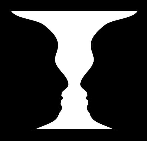
One of the best-known examples of visual perception is the Rubin vase, an image popularized by psychologist Edgar Rubin in 1915. The composition allows one to distinguish a white vase on a black background or, conversely, two black faces facing each other on a white background. The interesting thing is that the image remains exactly the same: what changes is our interpretation.
This phenomenon is known as figure-ground organization and demonstrates that the same composition can present different readings. In graphic design, the relationship between shapes and empty spaces allows for the incorporation of additional meanings. This is what happens with the arrow located between the letters E and X in FedEx or with the C that appears in the white space of the Carrefour logo. Although these examples respond to a design intention and do not function exactly like Rubin's vase, they share the importance of how we perceive visual regions.
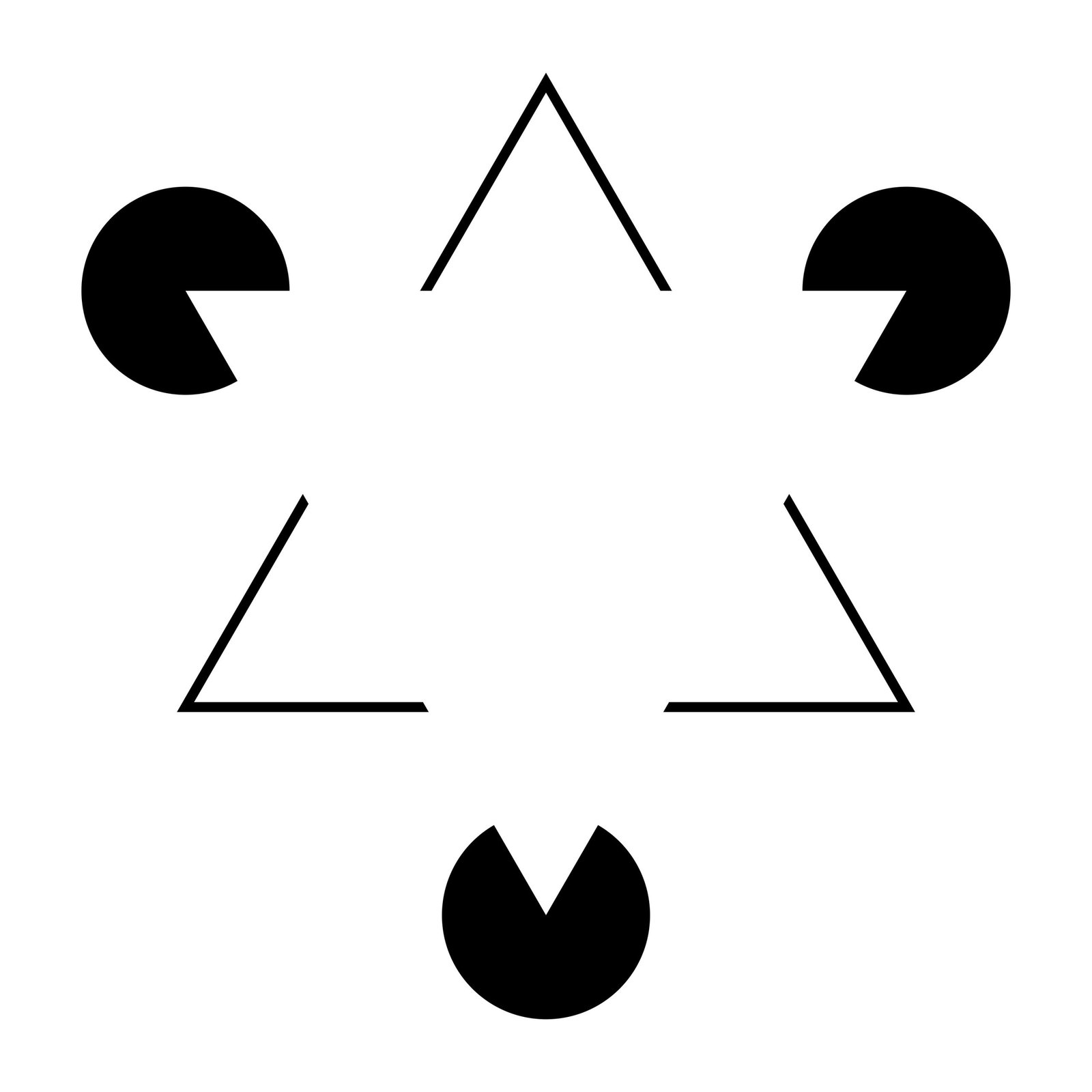
Our brain can also recognize figures without the need for all their outlines to be represented. This tendency is related to the Gestalt principle of closure. A particularly striking example is the Kanizsa triangle, a visual illusion formed by the arrangement of several geometric figures that provoke the perception of a white triangle whose sides are not drawn.
This effect is related to the so-called illusory contours, limits that we perceive even though there is no physical line representing them. The arrangement and orientation of the elements are essential: if we modify the composition, the figure may cease to be perceived. This mechanism explains why certain symbols and graphic compositions can suggest complete shapes using only fragments of their outlines.
Surely you have at some point observed a facade whose windows look like eyes or a cloud whose silhouette resembles an animal. This phenomenon is called pareidolia and it consists of recognizing familiar patterns in stimuli that were not necessarily created to represent those figures. One of the most common examples is facial pareidolia, which leads us to identify faces in everyday objects.
Science has studied how the brain responds to these apparent faces. Research published in Nature Communications in 2020 it identified rapid responses related to facial processing when observing objects that looked like faces. However, it is important to differentiate pareidolia from intentional design: while in a cloud we might find a figure by coincidence, in a logo with a hidden image the designer has deliberately organized the elements to suggest a second interpretation.
One of the curiosities of visual perception is that we can observe an image numerous times without detecting certain details. However, when someone points out a hidden figure to us, it becomes much easier to recognize it when looking again. This happens because our attention can be directed toward a specific area and because knowing the shape we are looking for beforehand influences how we interpret the composition.
This feature has interesting applications in logo design and visual identities. By using negative space, contours, and relationships between figures, designers can build compositions with more than one reading. However, incorporating hidden images does not guarantee that a brand will be more memorable or effective. Clarity, context, and communication objectives remain fundamental to assessing whether a visual solution works.
Our brain also participates in what we see
Visual perception demonstrates that observing an image is much more than receiving information through the eyes. Our visual system organizes elements, interprets their relationships, and can complete shapes that are not drawn. Gestalt principles, visual illusions, and pareidolia help us understand why we find hidden images in everyday situations and how these mechanisms can be leveraged in graphic design.