A sign isn't just "a sign for your company's name to be seen." It's the first impression of your business to someone who walks by. In seconds, the person gets an idea of whether it is serious, cheap, careful, homemade, modern, classic, ecological or the opposite.
That's why it's not just a matter of choosing whether you like a neon, a luminous box or some body letters more. It's all about deciding What you want to convey and use the sign as a tool to convey the essence of your business.
Before talking about types of signs, it is worth answering these three questions:
With that clear, it makes sense to choose the type of sign.
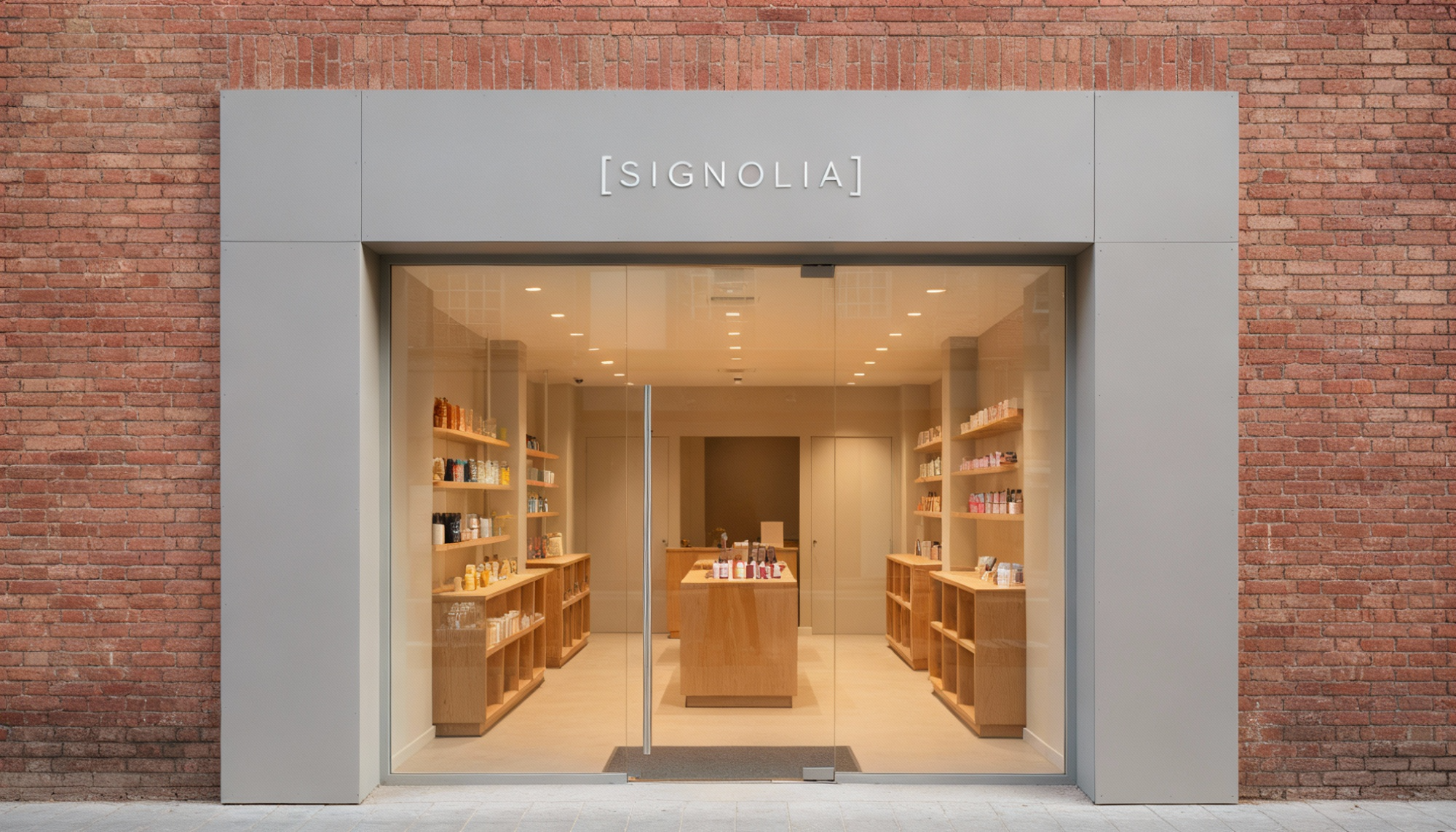
The minimalist sign usually has Clean typography , few elements, two or three colors at most, uncluttered backgrounds and polished materials. He doesn't shout, but he understands it at first.
What it conveys:
Order, calm, professionalism, control , feeling that everything is thought out. It gives that impression of "things are done well and orderly here".
When it works well:
Clinics, professional offices, architecture and design studios, premium service businesses, cafes and restaurants with careful aesthetics or coworking spaces.
When it might be a bad idea:
When you need to convey neighborhood warmth , home cooking, super close treatment or an identity with a lot of personality. In those cases, a Excessive minimalism can seem cold or distant.
Here come the Hand painted lettering , calligraphy, textured woods, aged metal, written blackboards, neon with personality. He does not seek to be perfect; seeks to appear alive.
What it conveys:
Closeness, humanity, trade, affection, history. It gives the impression that behind it there are people with names and surnames , not an anonymous brand.
Where it fits especially well:
Bars, taverns, specialty cafes, bakeries, pastry shops , neighborhood stores, small studios or workshops where the manual process is part of the value.
Risks if misused:
If overloaded or readability is not taken care of, it can look messy or unprofessional. It can also be shocking if the interior of the premises is very cold or technological: the promise of the sign and the reality of the business do not correspond.
In this case, The label is part of a system : same logo, same colors, same materials and repeatable solutions in dozens of stores.
What it conveys:
Homogeneity, security, immediate recognition. The message is "You know what you're coming for, here the experience is the same in any city ”.
When it's the best option:
Chains, franchises and brands with a presence in many points of sale . Also businesses that plan to grow and need a scalable sign system, easy to replicate and that withstands the test of time.
Key Takeaway:
The personality of the sign is usually more limited. The priority is that it is legible , coherent and adaptable to many different façades.
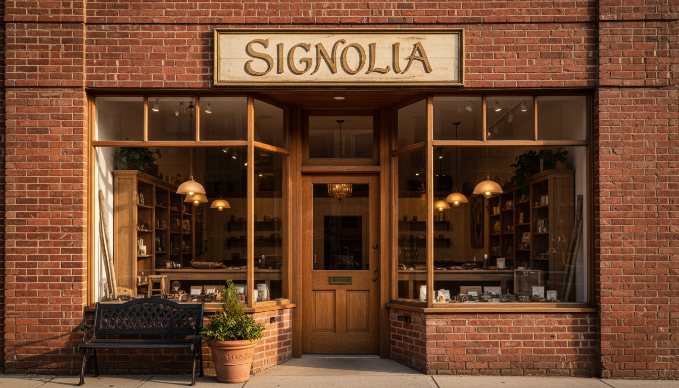
Use resources that are reminiscent of other times: classic typographies, worn colors, frames, filleting, references to old signage.
What it conveys:
Tradition, history, "product of a lifetime", flavour, memory. It works very well when the business wants to rely on the idea that it has been doing the same thing for years and that it does it well.
Where it fits in:
Wineries, gourmet shops, groceries, classic barbershops, cafes inspired by other times, businesses that recover a historical brand.
When it may not fit:
If your proposal is based on cutting-edge innovation, technology or a super digital service, it can generate the wrong promise.
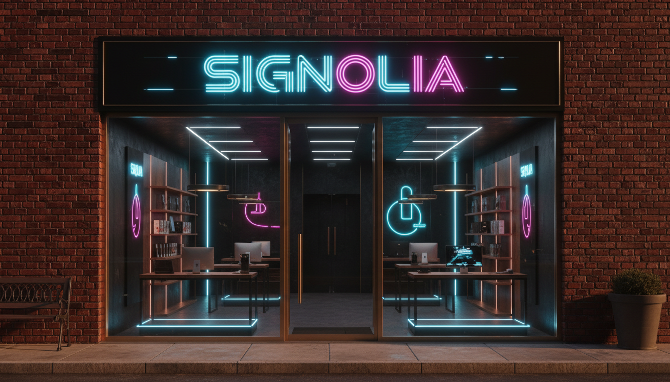
Here they come in Leds very present, digital screens, metallic finishes, clean volumes, light effects, Almost "futuristic" visual resources.
What it conveys:
Innovation, dynamism, technology, constant activity. It can give the feeling that The business is state-of-the-art in its sector.
Types of business where it works well:
Electronics stores, 24/7 gyms, gaming centers, technological academies, coworking spaces, software companies or digital services.
Aspect to take care of:
Not everyone wants "futurism." If your audience is more traditional, An excess of effects can intimidate or generate rejection.
If you want to be seen as a professional, orderly and current brand, the most logical thing to do is to move between signs Minimalist and more solutions Corporate .
If the most important thing is closeness, human treatment and the feeling of "home", the signs Craft and vintage They usually work better.
If your differential value is innovation, technology or a very dynamic service, it makes sense to bet on a more dynamic language. High-tech or digital.
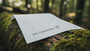
If sustainability is one of your pillars, a sign with materials and language echo It reinforces the message without having to say it a thousand times in text.
And if your battle is clearly the price, you can afford a simpler and more direct aesthetic, as long as you assume that the sign is going to tell that: "here the offers rule".
In the end, choosing a type of sign is not about fashions or "likes" or "dislikes", but about strategy . Every style—minimalist, handcrafted, corporate, vintage, tech-savvy, eco-friendly, or price-focused—is launching a Very specific message about your business , even when you don't say anything. Your façade is speaking for you 24 hours a day.
Therefore, before changing a sign or ordering a new one, it is worth asking yourself a simple question: Does what people see from the street match what I want them to think of my brand? If the answer is no, there you have an opportunity. Adjusting the type of sign to the message you want to convey is not only an aesthetic issue: it is a direct way to attract the right customer and to reinforce, every day, the identity you want to build.