


Live surrounded by images and messages digitally created that, while effective, they tend to resemble each other.
In the midst of this uniformity, Manual lettering stands out again as an option with its own character. It is not only a passing fad but a choice that brings authenticity, closeness and sustainable values. Many brands are turning to this technique because it allows them to show a More human identity , connect with your customers more directly, and leave a Different visual footprint in their environment. It is a tool that goes beyond design: it conveys commitment, personality and a unique way of communicating.
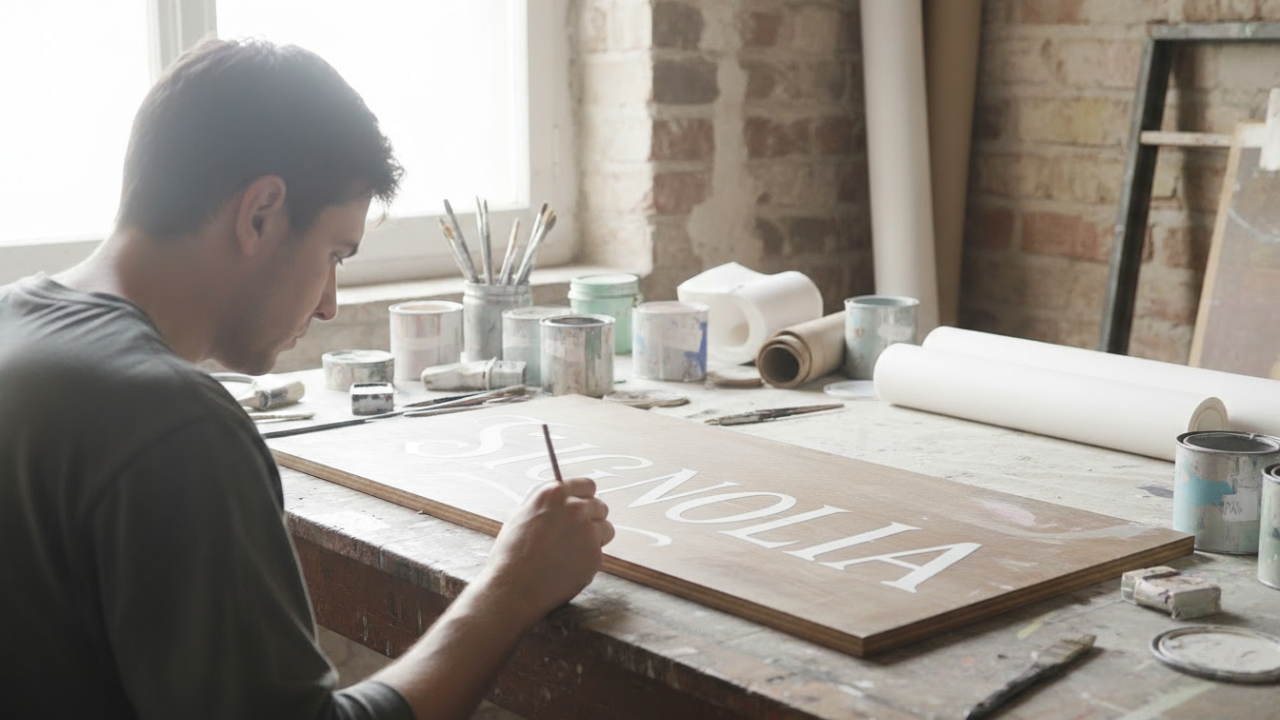
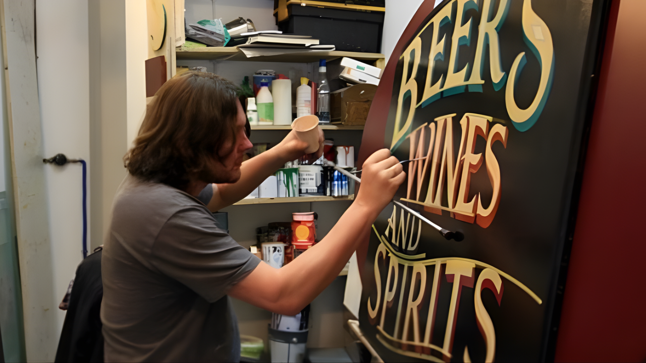
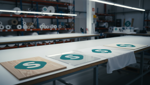
Manual lettering is increasingly being used in the Brand image of many businesses. Unlike digital designs, which can be copied exactly over and over again, A hand-painted sign is unique and it has little details that make it special . That difference, although subtle, helps a brand stand out from so many others.
The manual style it also transmits closeness . Seeing that something is handmade gives the feeling that there is a person behind it, not just a machine. This generates a Emotional connection with the customer. In addition, using handmade signage does not mean rejecting technology. Quite the opposite: it can coexist perfectly with other digital resources. It is a way to add value and personality to the visual communication of any business.
The choice of the colour it's a A fundamental element in signage , since it has a Direct impact in consumer psychology and in the emotions that a brand wants to evoke.
Warm colors like red can stimulate appetite and convey dynamism , as in the case of McDonald's, while cool tones like blue evoke confidence and professionalism , being a popular choice for technology or financial companies such as
Facebook.
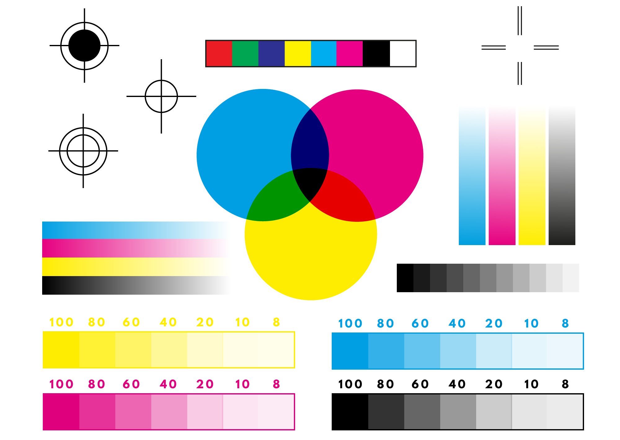
What distinguishes manual marking in this area is the artistic sensitivity applied to the process . Unlike digital printing, which relies on standardized color codes such as CMYK , The sign maker manually mixes the pigments , achieving unique tones, depths and textures. This ability to adapt color theory with artisanal execution allows create visual compositions with a richness and emotional resonance that go beyond the mechanical precision of a printer, ensuring that the sign is not only visible, but also memorable and consistent with the brand's identity.
The concept "Hand-Crafted Branding" is defined as the Developing brand identities that deliberately prioritize hand-crafted elements such as illustrated logos, custom lettering, and irregular details in order to project a distinctive, singular and authentic personality.
Historically many iconic brands were born with this out of necessity; before the era of digital typographies, logos such as those of Coca-Cola, Ford or General Electric were built through hand lettering.
Today, what was once a technical limitation has become a Strategic choice to convey exclusivity, closeness and a personal stamp , especially in sectors such as fashion, luxury goods, and consumer goods that are looking for a more intimate connection with their audience.
As for the "Slow Design" , is not committed to slowness, but to creation with purpose, depth and awareness. The principles of Slow Design are:
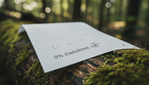
A hand-painted sign can also be a Sustainability Statement . This approach is in contrast to the culture of the ephemeral and disposable associated with many modern advertising materials. Traditional lettering uses Paints and varnishes which, in addition to offering a much longer useful life, have increasingly environmentally responsible options.
Using an industrial plastic product would create a cognitive dissonance one contradiction between what the brand claims to be and what it actually does . Instead, a hand-painted sign, which is by definition handcrafted, durable, and often made by a local artist, It perfectly aligns visual communication with the brand's discourse. In this way, the sign is no longer a simple identifier but a "proof of concept", a non-verbal storytelling that demonstrates the brand's commitment to its own principles. This is the fundamental difference between "telling" and "demonstrating".
Manual lettering is positioned as a Authentic, humane and coherent alternative with contemporary values. Your ability to contribute Personality, differentiation, and emotional connection makes this technique a valuable tool for brands that want to stand out without sacrificing their principles.
More than just aesthetics, the hand stroke reflects a Commitment to quality, sustainability and local identity. It is a tangible expression of what a brand stands for, capable of Build trust and transmit values .


